

Accessing student data is a key element of any SIS, but taking that data and analyzing it typically requires exporting out of the system and manipulating it with some other external tool. This is especially true when attempting to plan based on where your student population actually resides. But what if you could not only see where your students reside on a map but also be able to slice and dice the records by creating your own boundaries? Not only creating them but being able to share those regions with others. Well, with the use of Level Data’s new School Population Planning Report, users can now do just that.
How to run the report:
Before navigating to the School Population Planning Report, select from the start page the group of students for whom you want to run the report. This can range anywhere from a single student to the entire school or district. Once your students have been selected, click on RealTime Reports from the Level Data apps section of the start page. From the dashboard, select the School Population Planning Report. The prefilter will display with the selected group of students. If you navigated to the report without first selecting a group of students or you need to change the selected group, you can do so right from the prefilter. Simply click on the link to the start page. This will open the start page in a new tab. From here, select your new group of students. Switch back to the report tab and click the circular arrow. Once your student selection has been updated, click run.
Once the report loads:
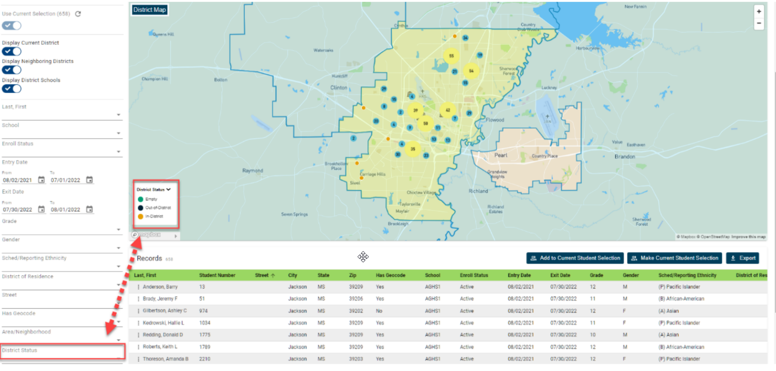
Once the report loads, a map of your district and the surrounding districts will be displayed along with the location of the selected students. Initially, student locations will be grouped by concentration. The size of the dot will depend on the number of students included in that area. Zooming in on the map will display more detailed results. Note that in order for a student's location to appear on the map, there must be a geocode associated with the student’s record. Geocodes are typically assigned by validating the student’s address.
While viewing the map, users can use the options to zoom in or out depending on the level of detail they need to see. Clicking on any of the dots on the map will bring up a window containing basic student information including such items as name, grade level, school attending, and home address. If you click on a dot that includes multiple students, you'll be able to view the individual data for each student by paging through the results at the bottom of the window. Visible students can be filtered directly from the map key, based on grade level, school, or district status. Changing one category to another will display the available filter options. For example, when set to grade level you can filter to any combination of available grades by simply clicking on the desired grade levels. Note that when selected, the corresponding filter on the left will display the selected values. In addition to narrowing the results on the map, enabling the filters will also update the student records visible in the table below.
By default, the options to display the current district, neighboring districts, and schools within the current district are all enabled. Users have the option to turn these features on or off using the filter on the left. If neighboring districts are displayed, the name of the district will appear in the upper left corner of the map as you move your mouse from one district to another.
To create a region:
To create a region, click on the polygon tool from the right side of the map. Once enabled, the pointer changes from a hand to a plus sign. We’ll start by drawing a rough outline of the initial region. Move your mouse to the starting point and left click on your mouse one time. Don't hold the left button down. Once your first point has been set, drag your mouse to the next endpoint and again left click one time. Move your mouse to the next endpoint and again left click. Repeat these steps until you form the basic shape of your region. When you've reached the last point, move your mouse over that final point until you see the icon change back to a hand. When the hand appears, left click one more time to save the region. Once the region setting dialog appears, you can give the report a name. Note that there is a 15-character limit for both regions and folder names. By default, regions will be saved to a folder called my regions. However, you can create additional folders.
To create a new folder, simply enter the name of the new folder under the region folder area. Once created, you'll be able to select the folder in the future. If a user would like others to be able to see the region they’ve created, they can check the option for “others can view ''. If you'd also like to give others permission to modify your regions, you can check the option “other users can modify”. Note that users can only modify a report if they have the ability to see it. If no sharing permissions are granted, only the person that created the region will be able to see it. Once finished, click save.
After you've created the initial outline, you can move or modify the region. The best option is to zoom in a bit on the map so you have a clear image of the area being outlined. To move the region, click on the shaded area to display the dotted outline. Left-click anywhere inside the dotted line and move the region to the new location. Release the left button of the mouse and drop the region in the new location. To modify the shape of the polygon, click on the shaded area to display the dotted outline. Along the outline, you'll see small circles. Using your mouse, you can grab onto the circles to adjust the outline as needed. Click on the circle and the icon becomes a cross. You can now drag the boundary to where you need it to be and then click to release. Note that the further you are zoomed in, the more detailed you can make your boundary.
If you begin to create a region and decide you don't want to keep it, you can either move your mouse over the last point, open the region setting dialog and click delete, or you can drag your mouse to the delete button on the far right side of the screen. Once your region has been created, it will appear on the map and you'll be able to access the settings using the filter-visible regions key on the bottom left of the map. The list will now show the folder and region that was just created. If you'd like to hide the region, you can click on the eyeball to the left of the report name. This is not removing the region, just hiding it from the current view. Clicking on the eyeball again will add the region back to the map.
The pencil icon provides access to the settings dialog. From here you can make changes to the report name, folder, and sharing permissions. You also have the option to make a copy of the region or delete a region. Making a copy can be helpful if you have view-only permission to a shared region but want to make changes. In this case, you can make a copy of the region and then make changes without affecting the original region.
Clicking on the down arrow will bring up a list of all available regions, those that you've created as well as those that have been shared. Note that by default no regions are displayed when the report is open. The user will need to select which report they wish to view. To add a region to the map, check the box to the left of the region. Once selected, all regions will be visible both on the map and at the key at the bottom left.
As indicated previously, the filter visible region key will display the list of all regions currently selected along with the folder and user to which they belong. In addition to the show, hide, and edit icons, the filter will also indicate the level of sharing permissions granted. The “V” meaning visible and “M” meaning able to modify. Users do have the ability to expand or collapse the menu by clicking on the arrows at the top right of the key.
Once regions have been made visible on the map, the user will then have the ability to filter student records based on selected values. Clicking on the drop-down from the filter, from the left of the report will display all regions that have been selected for view. Please note that only those regions that have been selected from the filter visible regions key will appear in the filter drop-down. As with our other filters, check the box to the left of the region you wish to filter on. If more than one region is selected the report will include all students that match any of the selected filters. Users can then apply other filters as needed to further narrow the results.
Exporting your report:
Once your records have been filtered to the selected groups, you have the options to work with this group of students back in PowerSchool by selecting the make current student selection or add to current student selection buttons. If you'd prefer to export the records, simply click the export button. This will export all filtered records along with all of the visible data to a CSV file.